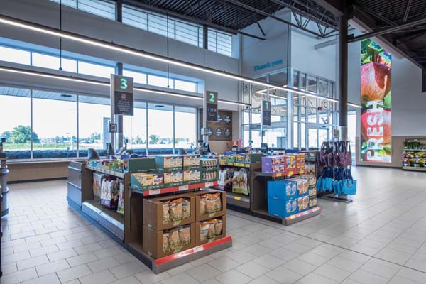
ALDI needed fresh ideas, including a revamped store layout to showcase products, and they needed it all to be seamlessly rolled out to hundreds of grocery locations across the U.S. ALDI hired JLL Design Solutions, (www.us.jll.com). to create a new store design.
One of the first moves the JLL team recommended was bringing the produce department from the back of the store to the front so that shoppers could see the bright fruits and vegetables at the beginning of their shopping journey. They also added dynamic graphic signs that deliver ALDI’s message of quality and value in their signature lighthearted voice and refreshed endcaps to feature playful and exciting products like florals, reinforcing a sense of freshness.
The new “Modern Market” concept, designed to emphasize the grocer’s quality and freshness, focuses on healthy food, produce and wine, to attract a more sophisticated shopper while retaining loyal core value shoppers.
Some of the key features of the Modern Market concept, first rolled out in California include: An open and inviting layout, High visibility of fresh produce and healthy foods, Elevated experience for key categories like wine and beer, Improved navigation and convenience and A look that communicates more than value. The ALDI/JLL collaboration also produced a refreshed shopper journey, from the exterior to the interior, where they opened the ceiling to brighten things up and give the illusion of a larger footprint. That also improved shoppers’ sightlines to eliminate any potential feelings of clutter or confusion.
The team then redesigned key lifestyle departments like wine to elevate the brand further and attract a broader audience. At the same time, updated merchandising fixtures with natural finishes kept ALDI’s aesthetic warm but minimal. On the outside, the store’s exterior was reimagined slightly for adaptability across formats from urban centers to suburban strip malls.
ALDI’s New Experience Delivers More For Its Shoppers
